
My Work
Baby Bloom
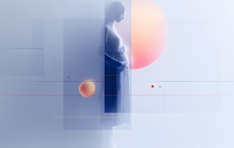
Baby Bloom is a pregnancy support app designed to help expecting parents stay connected with their support team, track moods, and manage key tasks before delivery. The client’s goal was to redesign an outdated, disjointed UI into a modern, emotionally supportive, intuitive experience.
I led the redesign as the lead product and interaction designer, defining the feature list and flows, directing the visual design, and completing the key screens and interactions in Figma. During a two-week redesign sprint, I ran foundational discovery work including stakeholder interviews, three user interviews with people who had experienced pregnancy, a heuristic evaluation, and a competitive analysis of pregnancy and parenting apps to ground decisions in real needs.
Based on research, we prioritized the features that matter most in high-stress moments: support-team contact upload, assignable tasks, lightweight mood tracking, and push notifications and real-time updates for labor. I also helped improve accessibility and clarity by addressing hierarchy, contrast, and iconography, and structuring the app so updates can be pushed quickly during labor. The result was a polished, developer-ready redesign that turned a broad vision into clear, cohesive user flows.
BeeHave
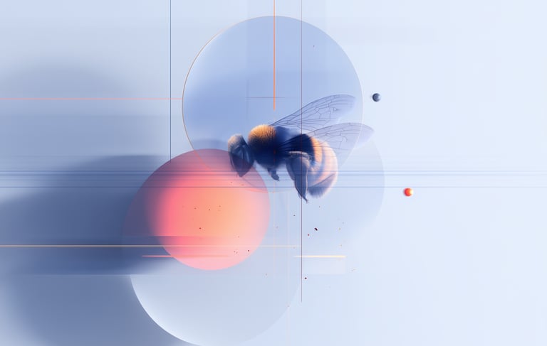
An Apple Developer Academy capstone: a classroom management app that helps teachers log student behavior quickly and generate shareable behavior reports for parent communication.
I served as a UX and product designer on a cross-functional team, and we translated teacher needs into concrete product requirements. We shaped the experience around fast behavior logging, teacher-friendly workflows, and report generation, then tested prototypes to validate that teachers could complete core tasks efficiently, including logging incidents within a small number of steps and exporting reports easily.
BeeHave’s core value is giving teachers clean documentation and patterns over time, so they can communicate clearly with parents, colleagues and better support students.
Lost Arts Next Gen
Lost Arts Next Gen is a nonprofit dedicated to equipping youth with essential life skills through programs like fishing, hunting, archery, and nature-based activities. They needed a website that introduced the organization, communicated the mission, and made it easy for visitors to purchase event tickets and donate.
I was the sole UI/UX designer and front-end developer, using a no-code platform to bring the site to life. I started by clarifying goals, audience, brand direction, and required features, then translated that into a moodboard and wireframes that I reviewed with the client to align on structure and flow before building.
From there, I created custom graphics and combined AI-generated visuals with client photos, then developed a responsive, clean site focused on clarity and conversion. The final result supported event signups and donations, and helped the nonprofit show up with a cohesive brand presence from day one.


Connected Schools
Connected Schools is a student check-in tool designed to give educators daily visibility into how students are feeling and who may need support. I was brought in to lead user research and make sure the product addressed the real constraints and emotional realities of school communities navigating safety and student well-being. This case study is research-focused, and screen designs are omitted due to an NDA.
As the sole UX researcher, I partnered closely with the project manager, two development teams, and stakeholders. I documented scope, goals, methods, and then conducted research across teachers, students, counselors, administrators, plus a data analysis professional to pressure-test how insights could translate into action.
Synthesis and journey mapping surfaced where the MVP should focus first, and I recommended solutions like under-30-second daily check-ins, privacy-first student interactions, trend-focused dashboards, feedback loops, and training/resources so educators can interpret signals and respond appropriately. The big takeaway: in schools, UX is about trust, clarity, and safe escalation paths, not flashy features.

© 2026 Alesha Duncan
Digital Product Specialist